
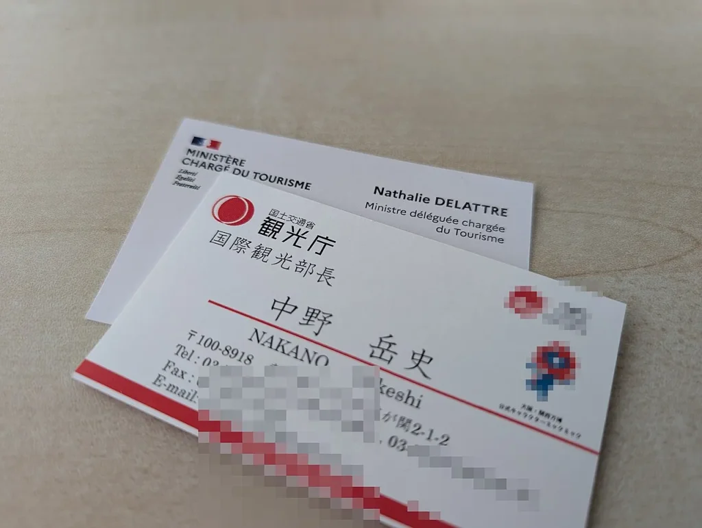
Business cards templates save you from the one thing that ruins most DIY cards: guessing at sizes, margins and bleed. Pick a layout that already has the proportions right, drop in your details, and you can spend your energy on the part that matters, which is whether the card is worth keeping.
Here’s how to choose a template, what to put on it, and how to avoid the mistakes that make a printer send your file back.
Start with the size, not the style
Before you fall for a pretty layout, check its dimensions. In the US the standard card is 3.5 by 2 inches. Much of Europe uses 85 by 55 mm, and other regions have their own habits. If you print locally, ask the shop what they cut to. A template built for the wrong size will look fine on screen and then get trimmed in odd places.
Also look for these three things in the file itself:
- Bleed: extra background that extends past the trim line, usually around 3 mm or 0.125 inch. Your printer will tell you the exact figure.
- Safe zone: the inner margin where text and logos should stay so nothing gets clipped.
- Two sides: a front and a back, even if the back is only a solid colour.
What actually belongs on a card
Less than you think. A card is not a brochure. If you’re tempted to cram in every service you offer, stop and picture someone holding it at a networking event, looking for one thing: how do I reach this person?
Keep it to:
- Your name, large enough to read at arm’s length.
- Your role or what you do, in a few words.
- One phone number or email, two at most.
- A website or a single social handle.
- A logo, if you have one that holds up small.
The back is a good home for a short tagline, a map pin, or a QR code that points to your booking page or portfolio. Test the QR code with a real phone before you order a few hundred copies. I’ve seen cards go out with codes too small to scan, and that’s an expensive lesson.
Choosing among business cards templates by trade
The same grid doesn’t suit every person. Think about who’s receiving the card.
Consultants and office professionals
Go quiet. White or off-white stock, one accent colour, a clean sans-serif font. The goal is to look organised, and fancy decoration works against that.
Creatives and photographers
You can afford a bolder layout, even a full-bleed image on the front. Keep the contact block simple, though, or the photo and the text will fight each other.
Tradespeople and local services
Big phone number, clear service list, maybe your service area. People often grab these cards with greasy hands and need the number fast. Readability beats elegance here.
Shops and food businesses
A loyalty-card format, with boxes for stamps on the back, can double as a business card. Make sure the template leaves real space for the stamps rather than squeezing them in.
Fonts, colour and paper
Even a good layout can be wrecked by a few small choices, so slow down here.
Stick to two fonts at most. One for your name, one for everything else. Body text on a card should rarely drop below 8 pt, and smaller than that gets hard to read once ink spreads on uncoated stock.
On colour, remember that screens use RGB and printers use CMYK. A vivid screen blue can print noticeably duller. If colour matching matters, for example with a brand colour, ask your printer for a proof or a sample before the full run.
Paper changes the feel more than the design does. Matte feels modern and takes pen notes well. Glossy makes photos pop but you can’t write on it. Thicker stock feels more serious in the hand, though it costs more, so ask for pricing from your printer instead of assuming.
A quick comparison before you commit
Most business cards templates let you change these options without redoing the design, so weigh them up now.
| Choice | Good for | Watch out for |
|---|---|---|
| Matte finish | Writing notes, a calm look | Colours can look softer |
| Glossy finish | Photo-heavy cards | Fingerprints, no pen notes |
| Rounded corners | Friendly brands | Extra cost at some printers |
| Vertical layout | Standing out from the stack | Some wallets and holders don’t fit it |
Where to get and edit a template
Most online design tools include a library of card layouts you can edit in the browser. If you already use one, our notes on free Canva templates explain what you can reasonably expect from a free account. Word and Pages work too, though precise layout is fiddlier. If you want your cards to match other printed material, such as a leaflet, take a look at brochure templates so the colours and fonts line up across everything you hand out.
Starting a company and still working out what the cards should say about it? The thinking in our business plan templates guide can help you pin down who you’re really trying to reach.
Before you hit print
- Proofread every digit of the phone number and every letter of the email. Then have someone else do it.
- Export as a PDF at print resolution, usually 300 dpi for images.
- Include bleed and keep text inside the safe zone.
- Order a small batch first. Details change, and a pile of 1,000 cards with an old address is a sad sight.
Good cards are plain, accurate and easy to read. Pick one of the business cards templates that respects that, and it has done its job. Then hand the cards out, because a box in a drawer helps nobody.

Written by thadmin_r7
The Templates Hub editorial team writes practical, plain-English guides for everyday readers.
More articles by this author →
Nail Templates: Stencils, Guides and Printable Shapes Guide
If you have ever tried to paint a clean French tip freehand, you already know why nail templates…
Router Templates for Woodworking: Make Reusable Jigs
Router templates are simple guides that let a woodworker cut the same shape again and again. A well-made…
Avery.com Templates: Finding and Using Label Layouts
www.avery.com templates explained: match your product number, pick the right layout, set up the print and avoid common…
Infographic Templates: Tips to Make Data Easy to Read
Infographic templates let you present facts, steps and comparisons as pictures that people actually finish reading. Rather than…