
Busy people rarely read long documents, which is why a single page can carry more weight than twenty. One pager templates give you a fixed frame for squeezing a project, product, proposal or business idea onto one sheet, with every inch doing a job. This guide explains what to put on a one pager, which layouts suit which purpose, and how to edit without letting the page turn into a wall of text.
What is a one pager?
A one pager is a concise summary meant to be understood in about a minute. Sales teams use them as leave-behind sheets, startups send them to investors, nonprofits attach them to grant applications and project managers circulate them for sign-off. The key idea is selection: you choose the most important facts, not every fact.
The core sections of most one pager templates
- A headline that states the point, not just the topic.
- The problem or context in two or three sentences.
- The solution or proposal in plain language.
- Proof, such as a number, a short quote or a logo of a known customer.
- The ask or next step, with a name and contact details.
Choosing the right one pager for the job
Business or startup overview
Includes the problem, product, market size, traction, team and funding sought. Investors skim, so use clear labels and keep numbers prominent. If you also need a longer plan, our guide to the one-page business plan goes through each box in detail.
Product or service sheet
One image, three benefits, a price or starting point, and a contact. Think of it as a printed ad that a person can keep.
Project brief
Goals, scope, timeline, owner, risks and success measures. It is useful for aligning stakeholders before a kickoff.
Policy or briefing note
Common in government and nonprofits: issue, options and recommendation, written to help a decision-maker choose quickly.
Design tips for a one-page layout
- Limit fonts to two. One for headings, one for body text.
- Use white space. Crowding makes a page look professional less, not more.
- Anchor the eye. Put the strongest number or phrase top left, where reading begins.
- Use columns sparingly. Two is plenty; three needs very short text.
- Check printing. Margins that look fine on screen can be cut off by a printer.
Writing for a single page
The hardest part is cutting. Write everything you want to say, then remove half. Replace long sentences with short ones. Choose concrete figures over vague words: “cut onboarding time from 10 days to 4” beats “improved efficiency”. Read the page aloud; if you run out of breath, split a sentence.
Tone
Match your reader. A grant officer expects measured language; a customer wants friendly directness. Avoid buzzwords that could describe any company.
Editing templates in common tools
Word and Google Docs both handle one pagers well, using tables to keep sections aligned. PowerPoint and design apps give you finer control over visuals. If you use a Word file, set the page to one page only and export it to PDF for sharing, so fonts and spacing remain intact. Our article on Microsoft Word templates explains how to keep styles consistent when you edit.
Mistakes to avoid
- Cramming in a second page worth of text at a tiny font size.
- Leaving out contact details.
- Using stock images that say nothing about the subject.
- Forgetting to update dates, prices or team names.
The US Small Business Administration’s guidance on writing a business plan is a useful reference when you need to check which facts an overview should contain.
Using one pagers in sales
For service businesses, a one pager that sets out what you do, who it is for and how pricing works can speed up conversations. Pair it with the thinking in how to price your services so the numbers on the page are ones you can defend.
In summary
A strong one pager is the result of decisions: what to include, what to cut and what you want the reader to do. Pick a template that matches your purpose, fill it with specific facts, and keep the design calm. When someone reads it in a minute and knows exactly what you are asking, the page has done its job.
A short before-and-after example
Imagine a small cleaning company drafting its first leaflet. The first draft opens with “We are a family-owned business established in 2012 that is passionate about quality”, followed by a long list of services and a paragraph on values. A reader’s eyes slide off it.
The rewrite turns the headline into “Spotless offices, same price every month”, then lists three benefits: fixed monthly pricing, vetted staff and a free first visit. One customer quote sits beside a clear phone number and a booking link. Nothing about the owner’s history has been lost; it just moves to a single line at the bottom. The page now works for a stranger who has thirty seconds.
Notice what changed. The facts are the same, but the order follows what the reader wants to know. That is the trick behind every effective one pager, whatever the template looks like.
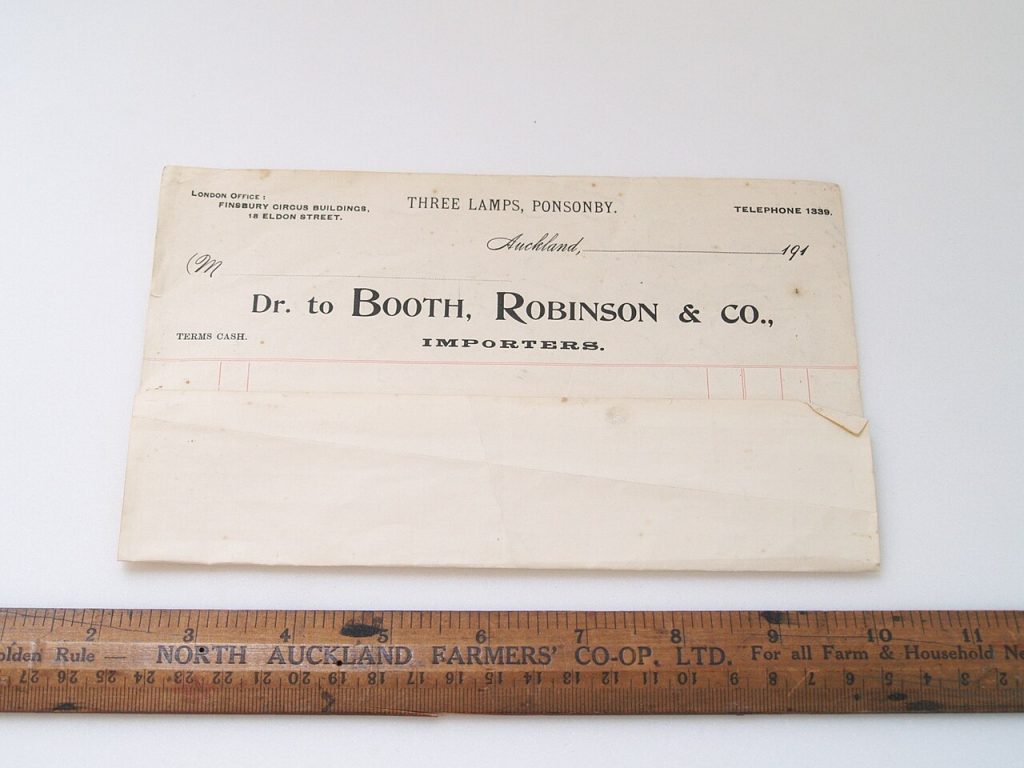
Image: “Form, stationery (AM 674191-2)” via Wikimedia Commons, CC BY 4.0.

Written by
The Templates Hub editorial team writes practical, plain-English guides for everyday readers.
More articles by this author →
Point of Care Medicine Templates: Types, Benefits and Risks
In a busy clinic, documentation competes with the patient for attention. Point of care medicine templates are structured…

Google Drive Templates: Organise and Reuse Your Files
Most people treat Drive like a junk drawer where files go to be lost. A cleaner approach is…
Microsoft Word Templates: Find, Edit and Build Your Own
Word has been the default tool for letters, reports and CVs for decades, and Microsoft Word templates are…

Microsoft Templates for Word, Excel and PowerPoint Explained
People searching for Microsoft templates usually want one thing: a ready-made file that saves them an hour. The…