
Open a blank deck and the first thing most people do is stare at it. Microsoft PowerPoint templates exist to skip that moment. A good one hands you consistent fonts, colours and layouts, so you can focus on what the slides should actually say. A bad one buries your message under clip art and gradients.
This guide covers where PowerPoint templates come from, how to pick one that suits your talk, and how to customise it so it feels like yours instead of something everyone has seen before.
Where Microsoft PowerPoint templates come from
There are three main sources, and each suits a different situation.
- Built-in options. PowerPoint includes a gallery of designs when you choose File > New. These are tidy and safe, and they work offline.
- Microsoft’s online library. The same New screen can search a larger catalogue, including pitch decks, training slides and event agendas.
- Third-party and free sites. Design marketplaces and community sites offer thousands of styles. Quality varies, so check the licence and preview the file before relying on it.
If you want an official overview of how templates are applied, Microsoft’s own PowerPoint support pages explain the basics of themes and layouts.
How to choose the right template
Start with your audience, not the look. A quarterly review for a finance team needs clear charts and plenty of white space. A talk at a community event can be more visual. Ask yourself three questions.
- How much text will I show? If your slides carry paragraphs, pick a plain layout with wide text areas. If you use large images, choose one that supports full-bleed photos.
- Will it be read or presented? A deck sent by email is read on a small screen, so it can hold more detail. A presented deck should have big type that works from the back of a room.
- What are my brand rules? If your company has fonts and colours, choose a template that lets you change the theme in one place.
Customise a PowerPoint template in ten minutes
Do not edit slide by slide. Use the Slide Master (View > Slide Master) to change fonts, colours and logo positions once, and every slide follows. Then:
- Set the theme colours so charts pick up your palette automatically.
- Replace the heading and body fonts. Pick two at most.
- Remove layouts you will never use, which makes the layout menu easier to navigate.
- Add your logo to the master, not to individual slides.
Keep slides readable
A common rule is one idea per slide. If a slide needs a paragraph of explanation, split it. Use at least 24-point text for body copy, and keep line length short. Contrast matters more than style: dark text on a light background, or the reverse, but never mid-tone on mid-tone.
Use charts and images with care
Native PowerPoint charts stay editable and match your theme, so prefer them to pasted screenshots. For photos, use ones you own or have a licence for. A single strong image beats a collage of small ones.
Common mistakes with PowerPoint templates
The most frequent problem is leaving sample content in place. A forgotten “Your Title Here” in the footer is easy to miss and embarrassing to find in front of a client. Run a quick check using the Outline view, which shows all the text in one list.
The second mistake is mixing templates. Copying slides from several decks brings in different masters, and your file ends up with a dozen themes. Use Keep Destination Theme when you paste.
The third is ignoring file size. Large uncompressed photos make a deck slow to open and hard to email. Use Compress Pictures before you send it.
Present the story, not the template
Even the best design cannot rescue unclear thinking. Write the three things you want the audience to remember, then build slides that support them. If you are presenting a plan, our short guide to a one-page business plan is a handy way to organise the content first. If your talk is about sales or pricing, the post on pricing your services offers a clear structure.
Are free PowerPoint templates good enough?
For most internal talks, yes. Free templates are fine for school, community and team meetings. For client proposals, investor decks or conference keynotes, consider paying for a polished set or hiring a designer to build a custom master. Always read the terms. Some free files forbid commercial use or require a credit line.
A short checklist
- Fonts and colours match your brand.
- Every slide has one clear message.
- Text is large enough to read from a distance.
- Images are licensed and compressed.
- All placeholder text is gone.
- You have rehearsed at least once with the real file.
Wrapping up
Microsoft PowerPoint templates are a shortcut, not a substitute for a good message. Choose a design that suits your audience, set it up properly in the Slide Master, and keep every slide simple. Do that and your deck will look consistent, load quickly and let you do what a presentation is for: help people understand something.
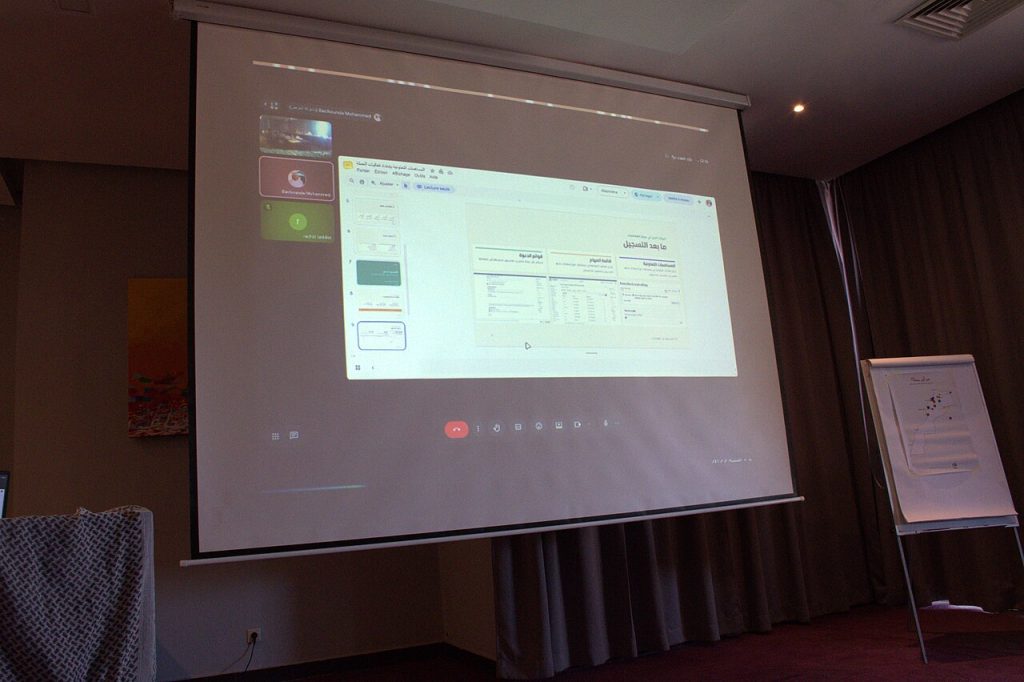
Image: video conference interface on a projector screen, WikiCamp Morocco 2026, via Wikimedia Commons, CC BY-SA 4.0.

Written by
The Templates Hub editorial team writes practical, plain-English guides for everyday readers.
More articles by this author →
Google Slide Templates Free: Licence and Format Checklist
Google slide templates free: a starting point, not a guarantee Plenty of google slide templates free of charge…

Google Slide Templates: A Step-by-Step Setup Guide
Picture a Monday meeting where three people present three decks, each with a different font, a different logo…

PowerPoint Presentation Templates for Pitches and Reports
The difference between a forgettable slide deck and one that sticks rarely comes down to software skill. It…

Power Point Templates: Spot a Good One and Edit It Well
Search habits are funny: plenty of people type “power point” with a space, and what they want is…