
Search habits are funny: plenty of people type “power point” with a space, and what they want is exactly the same thing as everyone else, a deck that looks good without a design degree. Power point templates give you that, provided you know how to choose and edit them. This article takes a hands-on view: how to spot a well-built template, what to change first and how to make a deck that holds attention.
Spotting a well-built template
Two templates can look the same in a thumbnail yet behave very differently once you start typing. Open the file and look under the surface.
- It uses a Slide Master. In View > Slide Master, you should see sensible layouts such as title, section, two columns and picture with caption. If every slide is built from loose text boxes, editing will be painful.
- It has theme fonts and colours. Check the Design tab; if colours are defined, charts and shapes will follow them automatically.
- Placeholders are real placeholders. Clicking a title area should show “Click to add title”, not a text box you can drag by accident.
- It handles widescreen. Modern screens use 16:9. Older 4:3 designs look squashed on projectors and monitors.
What to change first
- Fonts. Replace theme fonts with your own via Design > Variants > Fonts.
- Colours. Set two main colours and one accent. Dark text on light backgrounds remains the most readable.
- Logo. Add it to the Slide Master so it appears everywhere.
- Footer. Include slide numbers and a short title, which helps during question time.
Layouts you will use the most
Title and section dividers
Use these to give your talk a clear beginning and to signal a change of topic. A section divider is a breath for the audience.
Content with image
One good photo and a short message. Avoid placing text over busy pictures; add a semi-transparent panel if you must.
Comparison and two-column slides
Useful for before and after, pros and cons, or two options side by side.
Data and chart slides
Give each chart a headline that states the conclusion, such as “Sales grew 18% in the second half”, instead of a vague label like “Sales chart”.
Closing slide
End with a clear next step and your contact details, not a plain “Thank you”.
Designing for the room
Large rooms and small screens need different decisions. For a big room, use large fonts, strong contrast and no more than six lines of text. For a deck that people will read at their desks, you can include more detail, but keep structure clear with headings and white space. Test your slides on the actual screen if possible; colours can look washed out on projectors.
Animations and transitions: less is more
A subtle fade or a simple appear effect can guide attention, but heavy animations are distracting and sometimes slow older computers. Choose one transition and use it everywhere. If you use animation to reveal bullet points, make sure each reveal has a reason, for example when you want the audience to guess before the answer appears.
Speaking with a template
Your slides support you; they should not be your script. Put the main idea of each slide in a few words and say the details aloud. Practise with the presenter view, which shows notes and the next slide, so you are not surprised. Our article on Microsoft PowerPoint templates goes through setup, and the piece on how to reduce stress has techniques you can use before a nerve-racking talk.
Free resources and licences
Free decks are available from Microsoft’s own library, design sites and educational projects. Look at the licence: some require you to keep a credit slide, and others do not permit resale. For images inside the deck, use sources that clearly allow reuse, such as Wikimedia Commons, and note the credit where required.
Accessibility checks
- Run Review > Check Accessibility.
- Add alt text to pictures and charts.
- Set a logical reading order for each slide.
- Do not rely on colour alone to convey meaning.
Saving and sharing
Share a PDF when you want the layout to stay fixed, and keep the PPTX when others need to edit. Compress large images first to keep the file small. If a deck is for a client, check document properties and remove hidden notes or comments before you send it.
When the subject of your deck is a plan, try writing the one-page version first; how to write a one-page business plan is a handy way to organise your thinking.
The upshot
Good power point templates are built on a proper master, use clear layouts and let your content stand out. Pick one that suits your audience, adjust fonts and colours, keep each slide simple and rehearse with the real file. That mix will give you a deck people remember for its message, not its decoration.
Troubleshooting common template problems
If fonts look different on another computer, the font is missing there. Embed fonts through File > Options > Save, or choose standard ones. If a template’s images look blurry, they may have been compressed; replace them with originals or use vector shapes. If changing the theme does not affect some elements, they probably have a fixed colour; select them and choose a theme colour from the palette. And if the file becomes sluggish, check for oversized pictures or embedded videos, which are the usual culprits.
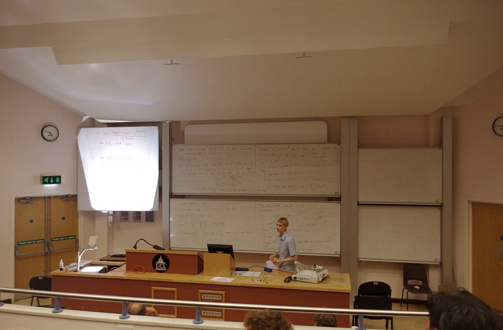
Image: “One Day Function Theory Meeting 2010 MMB 01 Dan Nicks” via Wikimedia Commons, CC BY-SA 3.0.

Written by
The Templates Hub editorial team writes practical, plain-English guides for everyday readers.
More articles by this author →
Google Slide Templates Free: Licence and Format Checklist
Google slide templates free: a starting point, not a guarantee Plenty of google slide templates free of charge…

Google Slide Templates: A Step-by-Step Setup Guide
Picture a Monday meeting where three people present three decks, each with a different font, a different logo…

PowerPoint Presentation Templates for Pitches and Reports
The difference between a forgettable slide deck and one that sticks rarely comes down to software skill. It…

Free Presentation Templates for Class, Work and Pitches
Think about the last presentation that held your attention. It probably had few words per slide, a clear…