
The difference between a forgettable slide deck and one that sticks rarely comes down to software skill. It comes down to structure, and PowerPoint presentation templates can supply that structure before you add a single word. Whether you are pitching an idea, teaching a class or reporting to a board, a template that matches your goal gives you a head start. Below are the categories of presentation templates you are likely to need, with advice on filling each one.
Presentation templates by purpose
Business pitch decks
A typical pitch has ten to twelve slides: problem, solution, market, product, traction, business model, team and the ask. The best templates keep the order and leave you to supply the evidence. Each slide should carry one message, written as a short sentence rather than a topic label.
Sales and proposal decks
These start from the customer’s problem, not your company history. A strong template has a slide for goals, one for your approach, one for pricing and one for next steps. If you need to price carefully, how to price your services is a useful companion.
Training and teaching slides
Educational decks need a clear agenda, learning objectives, short activities and a summary. Include slides that prompt discussion, such as a question with a blank space.
Status reports and project updates
Use a repeating layout: where we are, what changed, risks and next steps. Readers learn to find the point they need in seconds.
Event, wedding and community decks
These tend to be image-led, with big photos and minimal text. Look for templates with full-bleed picture layouts and elegant fonts.
Building a deck from a template in six steps
- Write the message first. Draft the three points you want the audience to remember in a plain document.
- Outline slide titles. Each title should state the point: “Customer complaints fell by half” rather than “Results”.
- Choose the matching layout. Text-only, image, chart or comparison.
- Add content sparingly. Remove anything that does not support the title.
- Review the flow. Use Slide Sorter view to check pacing.
- Rehearse aloud. Time yourself and cut if you run long.
Visual rules that keep decks clean
- Use no more than two typefaces.
- Keep body text at 24 points or larger when presenting live.
- Align items to the grid lines in the master; use View > Guides.
- Use real photos or simple icons, not mixed styles.
- Check that colours still work in greyscale if printed.
Making charts credible
Label axes, start bar charts at zero, limit series to what you can discuss and cite the source in small text. Replace default colours with your theme palette, and highlight the one bar or line you want people to notice using a stronger colour while the rest stay grey.
Working with images and media
Use high-resolution images and crop them inside PowerPoint rather than squashing them. Embed video only when necessary, and test playback on the presenting computer. Licences matter: sites like Wikimedia Commons explain which licences allow reuse and what credit to give.
Collaborating on a shared deck
When several people edit a presentation, agree on the template and the Slide Master first. Name sections, use comments for feedback and keep a single version in a shared folder. Avoid emailing multiple copies; merging them later is a nightmare. For team templates, put approved layouts in a custom template file so everyone starts from the same base. Our earlier article on Microsoft templates explains how to save one.
Delivery tips that no template can supply
Look at the audience, not the screen. Speak slowly at the start; nerves speed people up. Pause after a key point. Prepare a backup, such as a PDF on a USB stick and an online copy, in case of technical problems. Arrive early to test the display, and if you feel nervous, a few of the methods in our post on reducing stress can help.
Free versus premium
Free templates will cover most needs. Premium sets pay off for high-stakes pitches where a distinctive look matters, or when you need many layouts such as timelines, process diagrams and infographics. Check that premium purchases include editable charts and icons, not images of them.
Final checklist before you present
- Spelling and numbers double-checked.
- Fonts embedded or common, so nothing changes on another machine.
- All placeholder text deleted.
- Images compressed and credited.
- Notes added, and timing rehearsed.
In short
PowerPoint presentation templates are tools for structure. Match the template to the purpose, put one clear message on each slide, keep the design simple and rehearse. A deck built that way will help you speak clearly, and that is the point of a presentation.
Adapting one template for different audiences
A single deck rarely suits everyone. When you present the same material to executives and to front-line staff, keep the master but change the emphasis. Executives want the result and the decision needed on the first two slides; the detail can live in an appendix. A front-line team wants to know what changes for them on Monday morning, so lead with examples and practical steps.
Duplicate the file, rename it for the audience and re-order the slides instead of rebuilding. Put backup material after a clear “Appendix” divider so you can jump to it during questions without losing your place. This habit turns one good template into several useful presentations.
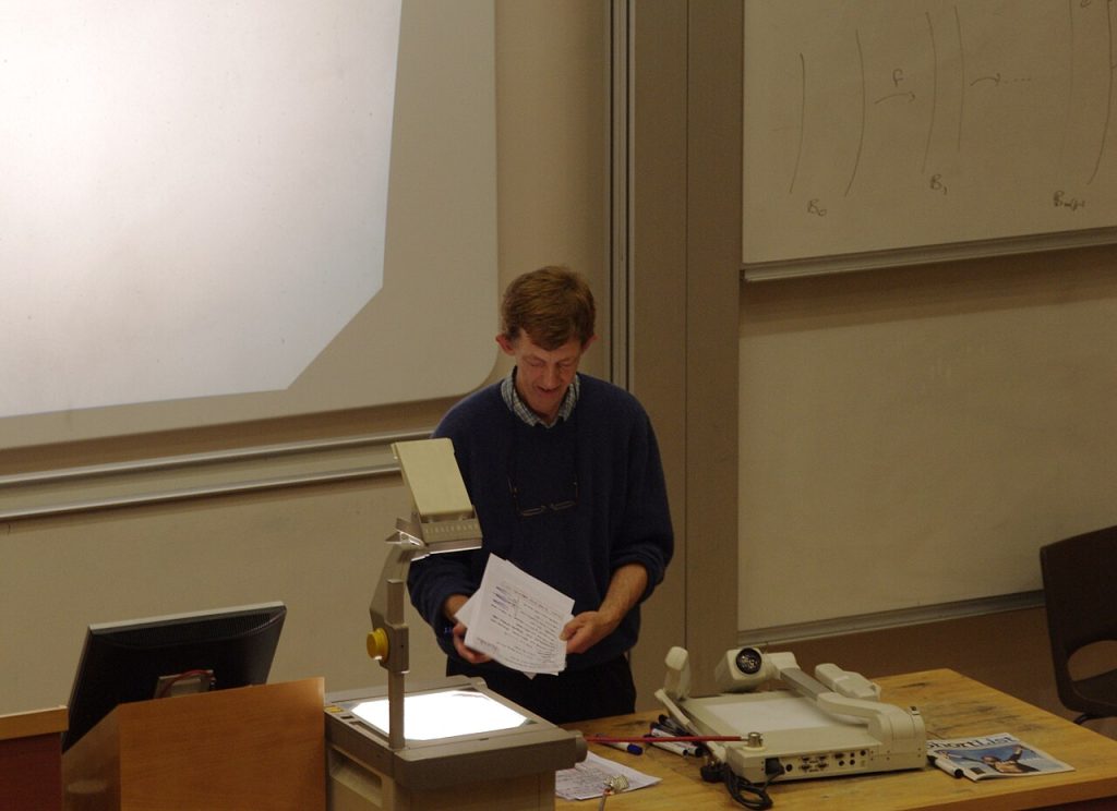
Image: “Workshop on Function Theory MMB 02 Phil Rippon” via Wikimedia Commons, CC BY-SA 3.0.

Written by
The Templates Hub editorial team writes practical, plain-English guides for everyday readers.
More articles by this author →
Google Slide Templates Free: Licence and Format Checklist
Google slide templates free: a starting point, not a guarantee Plenty of google slide templates free of charge…

Google Slide Templates: A Step-by-Step Setup Guide
Picture a Monday meeting where three people present three decks, each with a different font, a different logo…

Power Point Templates: Spot a Good One and Edit It Well
Search habits are funny: plenty of people type “power point” with a space, and what they want is…

Free Presentation Templates for Class, Work and Pitches
Think about the last presentation that held your attention. It probably had few words per slide, a clear…